
Redesigning and building a new platform to share stories about the UW Student Experience
My Role: Product Designer & Front End Developer
Company: University of Washington IT (Academic Experience Design & Delivery Team)
Timeline: 6 months
Tools Used: Figma, VSCode, GitHub, Vue, Bootstrap, HTML, CSS
Focus: Visual Design, Branding, Front-End Development
Where did Husky Voices originate?
The Academic Experience Design and Delivery (AXDD) team at UW-IT improves the academic experience by identifying unmet needs of faculty, students, and staff and designing technologies to address them.
One way they find unmet needs is by sending out student designers to do guerrilla interviews on campus, similar to Humans of New York. This allows them to learn more about the student experience, first hand. After having done this for five years, they had collected almost 100 interviews, containing stories about finding community at UW, the biggest challenges in college, the anxieties of college, and much more. It seemed to the team that keeping these interviews to themselves was a waste, when they could be used as a resource for students wanting to learn more about the UW student experience from their peers, and thus, the Husky Voices website project was born.
So, where does Delaney come into this?
I joined the Husky Voices project about a year into it’s design and development. First, I started by just conducting interviews, but then I became the sole designer when a previous student designer graduated. Once I finished the redesign process, I then transitioned into the front-end developer for the site. I wore many hats throughout this project & learned a lot from it!
What isn’t working with the current Husky Voices design?
To start this process, I reviewed the design work of the previous design to identify potential down falls in order to set clear goals for my iteration.

There is a lack of contextual information about what Husky Voices, a new user might be confused about what to do or the purpose of the website
The website isn’t recognizable as connected to UW, aside from a small logo in the header
Primary action button isn’t very eye-catching
Carousel of student photos are impersonal, it is hard to build connection with students aside from their looks, which may contribute to stereotypes


Other pages on the site also maintained the same bland design. The previous designers had chosen to make the website resemble somewhat of a newspaper, to fit the theme of interviews, but this led to a very plain, disengaging website that lacked much of a connection to UW.
After analyzing these screens and looking back at previous iterations of the projects, I identified my main goals for this redesign:
Redesign the home page to be more engaging and informational, drawing people deeper into the website
Provide users multiple ways to engage with the site and find an interview that they feel connected with or is interesting to them
Provide more context for what Husky Voices is
Incorporate University of Washington branding into the website design so that people understand it’s connection to the University, and trust the platform
Implement the design changes I come up with using HTML, CSS and Bootstrap
How can I incorporate the UW Brand into Husky Voices?
1. Identifying the UW Brand via an Interface Audit
To start, I needed to identify the core tenants of the UW brand in order to identify how I can carry it over into the Husky Voices UI. To do this, I analyzed several UW web pages, including the UW landing page.

Purple navigation bar featuring UW logo and branding, with simple navigation and primary action highlighted with gold button
Bold headers with all capital letters are utilized to bring even more attention to important information

Combination of graphical icons and labels for secondary navigation
Large purple footer contains a lot of UW branding and external linking to other ways to connect to/follow UW
Additional linking to more pages are displayed at the bottom
2. Review the UW Brand Guide
After doing the interface audit, I also read the UW brand guide and pulled out some key things, including the logos and colors.

According to the brand guidelines, these were the logos that I identified as being potentially useful for the Husky Voices website.

Purple and Gold are the key colors of the UW brand, representing pride and excellence.
3. Ideation and Iteration
To start, I just played around by adding the UW colors into what had already been designed, quickly iterating across several different combinations. In doing this, I considered what information should be highlighted by bold colors, the accessibility of various color combinations and the overall impression that Husky Voices should give.


Here are just two of many iterations that I went through, exploring color combinations and layouts of various pages on the site. I primarily ideated for desktop, but also kept the mobile views in mind.
Home Page Ideation
After exploring the brand design, I decided to jump into the home page design. I figured through designing the home page, I would be able to nail down the visual design even further. In this stage, I started ideating different concepts for the home page. Since there was going to need to be a lot of changes anyway, I explored several different options.
Concept #1: Card Collage
One of my initial ideas came from a page that I found while exploring the UW brand, Husky 100. This is where UW recognizes students who are doing extraordinary things with their time at school. On the page is a collage of student photos, and when you hover, they card flips over to give more detail about the student.
I tried three different variations of a card collage. These cards would show the face of the student who was interviewed, and then, when clicked or hovered, the card would flip and show information about the student such as their major, year, or a quote from their interview.
This design would give users a large variety of interviews to interact with and choose from.


Concept #2: Randomized Cards
After playing around with the collage style, I explored something more similar to the current design. In this idea, I incorporated three cards that would be randomized interviews, generated every time a user refreshes the page. These cards would provide information about the student such as their name, major, year, and a quote pulled from their interview.
With this design I added more contextual information about Husky Voices. This includes statistics such as the number of interviews conducted and number of stories collected.
Additionally, I included details about the different divisions of interviews on Husky Voices. Stories are segments of an interview with a particular theme. These themes were extracted from the coding that was conducted after each interview was transcribed. So an interview will have multiple stories. Collections are a group of stories with the same theme. These are the same themes that were used to code the stories. Some of these themes include: Advice, Choosing a Major, and Finding Community. By including these descriptions, users will have a better understanding of how to navigate the website.


Which concept to move forward with?
After presenting both designs to my team, we decided to move forward with Design #2.
We realized that Design #1 could lead to information overload, since there are so many options for users to choose from. Additionally, we wanted to differentiate the site from the Husky 100.
Design #2 provides users with a few options to select from, and if they don’t resonate with any of them they can refresh the page. It also met the second goal, of giving more context about the purpose of Husky Voices.


The Husky Voices Design System
After getting a better idea of the home page design and exploring the branding, I felt comfortable enough to create a design system. This allowed me to ensure consistency across the changes I made on other pages.
Font

Colors

Buttons

Navigation

Footer

Cards

Final Product
Home Page
Before

This home page serves as a jumping off point for users to browse the site and find interviews that they are interested in.
Individual Interview
Before
After
The Individual Interview page is where users can read all of the stories within an interview. Users can browse all of the stories, or sort based on the Collection, with the filter buttons at the top of the page.

Interview Browsing
Before


After

The Interview Browsing page is where users can view all of the available interviews. They can use the filters on the left side to narrow down the interviews based on the year of the student, the major, and the collections that are covered in that interview.
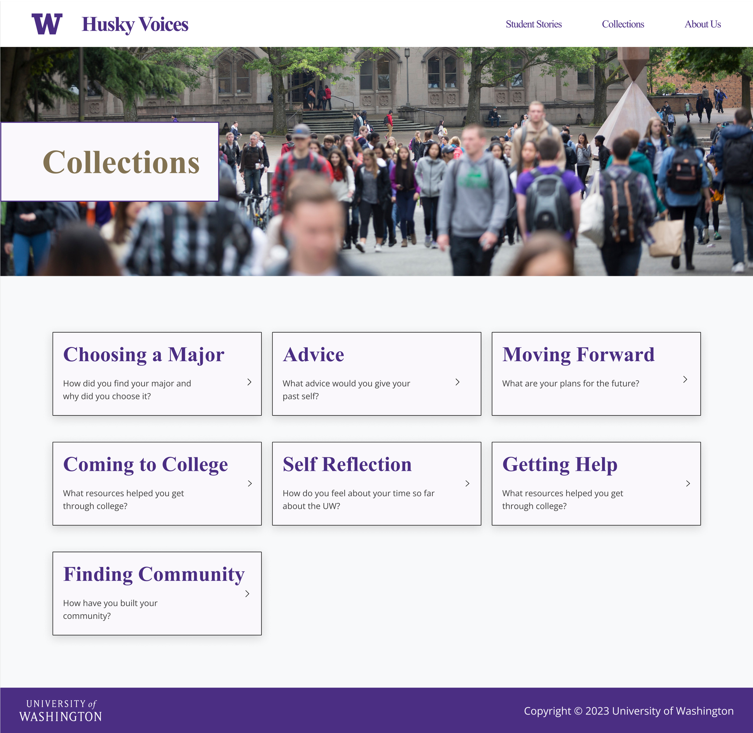
Collections Browsing
Before
The Collection Browsing page is where users can learn what the different collections mean, and can select a Collection to browse stories within that Collection.
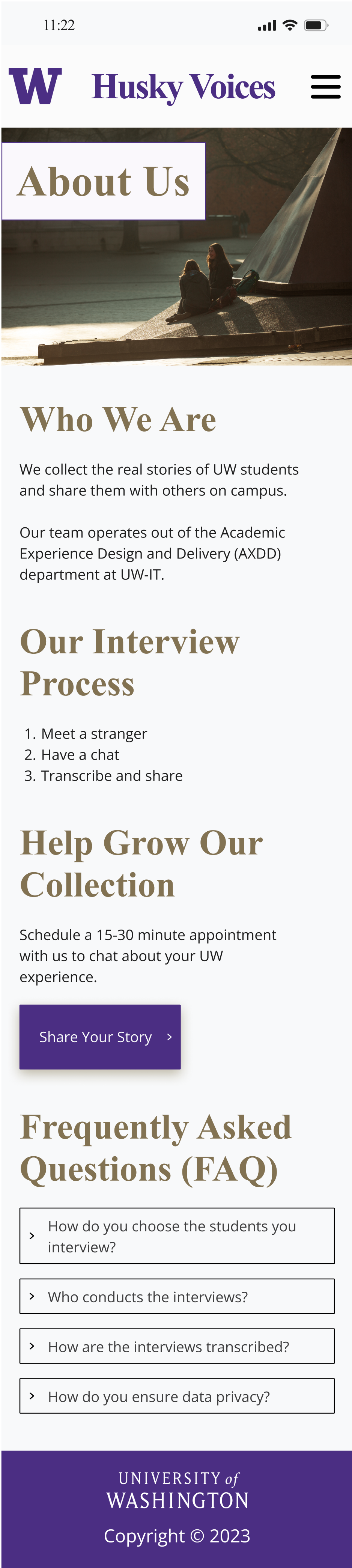
The About page is where users can learn more about the origin of Husky Voices, the Interview Process and they read the Frequently Asked Questions.

After
About
Before

Mobile Views


After

After


Reflecting
This project definitely put my visual design skills to the test, which was a fun challenge. I learned about how important a brand identity is for building trust with users, and how important color is in shaping an interface.
Looking back on this project, I’m most proud of the work that I did developing the front end. Although designing the upgraded interface was an interesting challenge, coding the front-end was an entirely new experience for me. It pushed me way outside of my comfort zone, and thus, I learned a lot. Through this project, I got comfortable using HTML, CSS, and Bootstrap to make my wireframes come to life! I also got to work in Vue for the first time.