


Getting facts to Americans with advanced search
Context
In the summer of 2022, I was lucky enough to be the sole UX Design intern at USAFacts. My main task was to design advanced search features to make the fact finding process easier on the website. I worked on a small team with the lead UX Designer, and two UX researchers, as well as collaborated across Engineering to get input from stakeholders.
My Role: UX Designer & Researcher / Product Owner
Company: USAFacts
Timeline: 11 Weeks
Programs Used: Figma, Miro, UserZoom
Methods: Interaction Design, UX Design, Concept Testing, Usability Testing, A/B Testing
Understanding the Problem Area
To begin my internship, I did some digging about the current search experience on the website. I looked into the past UX research conducted regarding search, as well as the metrics being collected on the usage of search. Since this is the first time I’ve worked on a product with real users, I was fascinated to see who was using the search and I found a lot of useful input to guide the beginning of my process. Several user quotes from previous studies can be seen below:

All this to say:
the current search system is not robust enough to facilitate efficient and effective searching
Users were struggling to find the information, articles and data visualizations they were looking for. This can range from users receiving no results at all or being overwhelmed with results and being unable to narrow them down.
Competitive Analysis
I started with competitive analysis, to see what was out there in regards to other on site search experiences.
Confluence: Powerful Search Engine with a Large Database


Two different views of the Confluence search, a large drop down (left) and a full page experience (right). Click to enlarge!
New York Times: Searching Similar Content

Takeaways

Search results should have context, either images or descriptive text, to help users identify if its a good fit

Basic filters can be shown right away, but complex ones can be hidden initially so as not to confuse users

Search terms should be editable, so that if a user changes their mind, they can easily search again
Ideating: Three Levels of Complexity
With these ideas in mind, I began ideating. I started identifying features that I saw reflected in the sites that I analyzed and that I thought would address the painpoints that were established earlier. I came up with three different levels of complexity of search experiences. This was in order to identify the bare minimum features that could be rolled out in an MVP and then be built upon later.
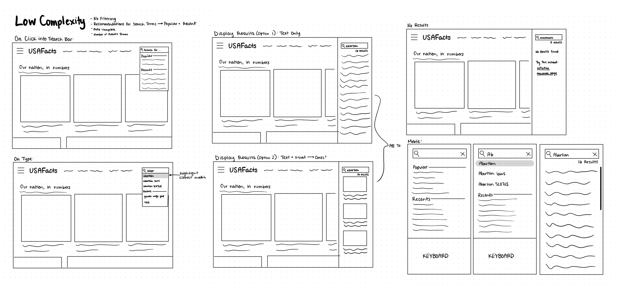
These sketches focused on the following features: suggested search terms, autocomplete, and number of results displayed

This level included the same features as the low complexity, while also adding: filtering with tags and descriptive text under each result
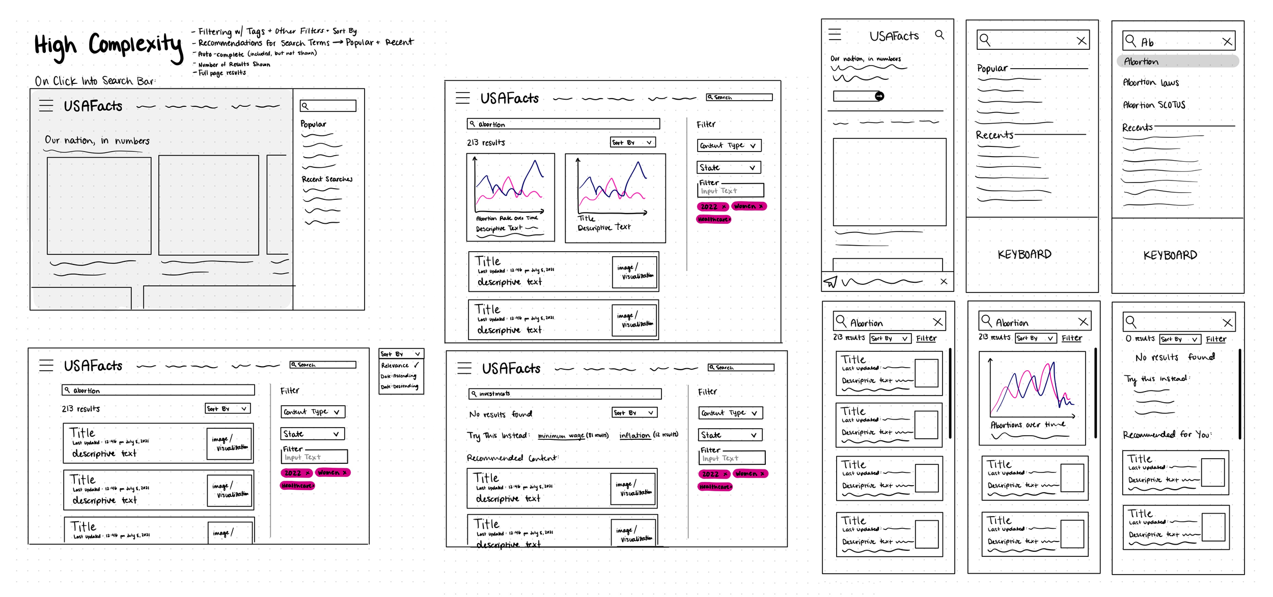
This, again, builds off the medium complexity, while also adding additional filters and card style results with data previews
Considering Feasibility with Stakeholders
Then, I met with stakeholders across Engineering, including a Technical Project Manager, a Front End Engineer, and a Data Engineer (as well as the rest of the UX team).This helped me get a better idea of the technical feasibility of my proposed designs and allowed me to get some initial feedback. Three majors questions arose from this meeting:
-
This came up because of the nature of USAFacts’ content. It ranges from “evergreen” (updated, everlasting) articles and date, to more news-like, current content, tied to major events in the US. This makes the usability of sorting by date ambiguous, would users really want it and would it be helpful?
-
The sheer number of filters available was a major concern for users if they utilized all of the filters provided, because they may end up with no results, which would be incredibly frustrating. This prompted me to try to find a balance between specificity and usability of filters
-
Although this is more of a technical question, it does impact the search experience greatly. It was decided that a semantic search algorithm will be implemented, which means that the algorithm will use the users intent, as well as the meaning of the search term, relationships between words & context of the search to provide the best fitting results. I took this into consideration when continuing to iterate & consider features.
Moving into Figma
I then took those sketches into Figma, translating them into mid-fidelity. With encouragement from my manager, I focused on the “high complexity” option, with the opportunity to whittle down the features after further testing and feasibility considerations. This also helped me get a better idea of what the experience will look like with the company branding & design system. Throughout this process, I created several iterations for each feature, across both mobile and desktop.
Search Recommendations
Version 1

Version 2
Version 3
Type Ahead
Version 1

Version 2
For the search results and filter views, I explored a lot of different variations and combinations. I primarily played with the form of the filters and the layout of the results, and how to format their details.
Search Results & Filters


Version 1


Version 2

Version 3

Version 4


Version 5
Version 6
Concept Testing Internally
After nailing down the 6th iteration, I decided to put together a concept testing study to get more feedback. Since this was my first time driving a research study alone, I designed it to consist of interviews & navigation tasks for a small number of USAFacts employees. This would allow me to get comfortable with conducting research, learn a lot about formatting a study, and familiarizing myself with UserZoom. I chose to run the study internally to get the perspectives of people who are both users and who understand the goals of the company more deeply.
Goals
● Identify useful/necessary options for filtering
● Identify ways in which to visualize results returned from a search
● Identify how users want results to be prioritized
Logistics
● 4 participants from across departments at USAFacts
● 4 different tasks with pre- and post- task questions
● All testing will be done virtually via Microsoft Teams & UserZoom
6 Key Takeaways
Participants prefer the full page of results view over the side bar design (desktop)
Participants were confused by the Issues filter
Some participants thought the Content Types were ambiguous or confusing
Participants wanted the ability to filter by location
Participants wanted results to be visualized in a different way
Participants think that sort by is a useful feature
Usability Testing
With the insights from the concept test, I made some edits to the wireframes and decided it was time to have actual users try it out.
Goals
● To understand general perceptions towards the proposed search
● To uncover any confusion or usability issues regarding the proposed search experience
● To understand the preferences (if any) between the two proposed search result & filtering capability layouts.
● To uncover additional improvements that could optimize the proposed search concepts for both mobile & desktop
Logistics
● Unmoderated study in UserZoom
● Soft launched to 2 participants on mobile, made edits and then full launched
● Full launch was both desktop and mobile
● 6 participants were included for each platform
● Half of users were new and half were returning
Version A


Version B
The findings from this study were:
Users strongly preferred Version B. The pill filtering design in Version A was confusing and unintuitive for users.
The advanced search button was not easily discoverable on mobile. Users were confused by the wording of “Advanced Search” and did not think it would lead to filters.
Users were confused about the wording and difference between the content types (specifically News, Reports, & Topics) across the website.
Finalizing Designs & Passing off to Engineering
I took the recommendations from the final round of user testing and implemented them into the high fidelity wireframes before finalizing. Below are the final mockups of my advanced search design project.
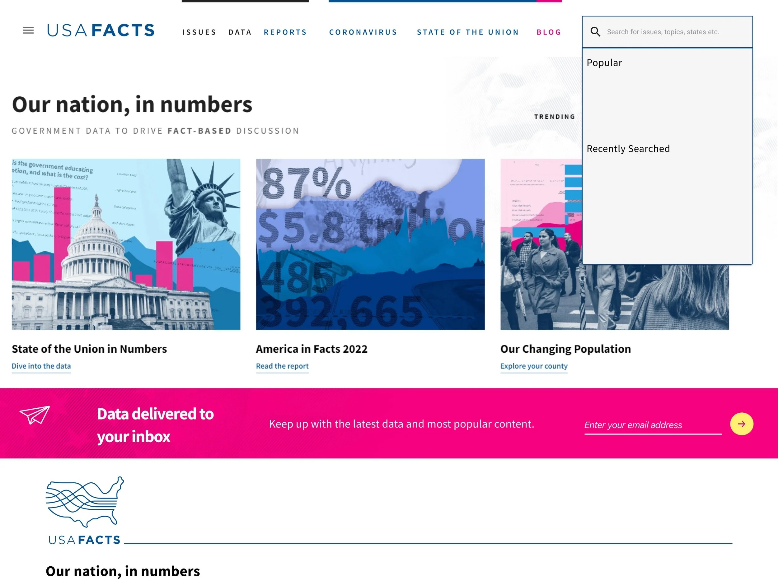
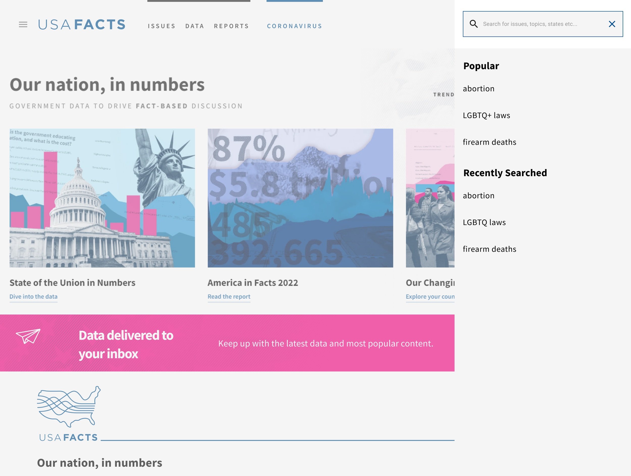
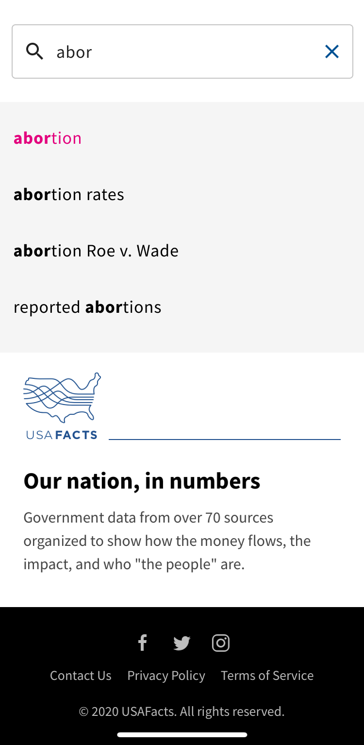
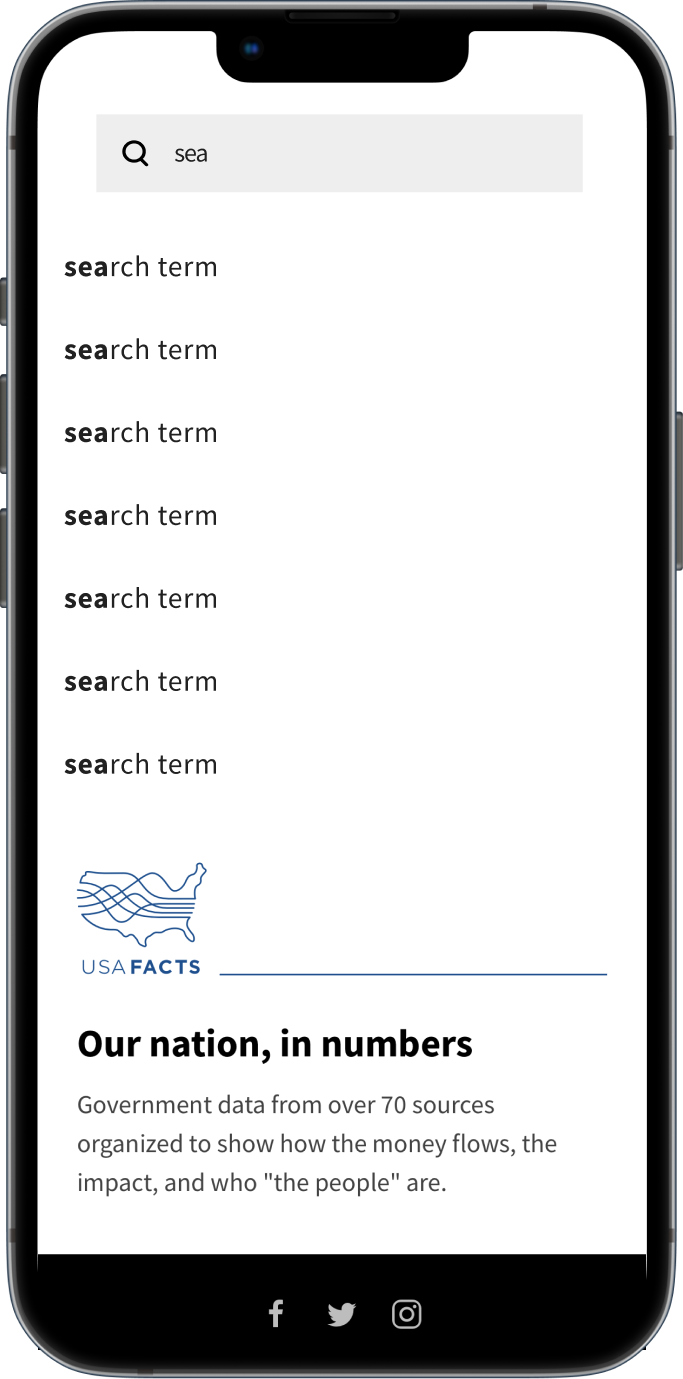
Recommended Search Terms
Recommended search terms are split into two sections, “Popular”, which are the most commonly searched words on USAFacts, and “Recently Searched” which will display the search term history for that specific user. This helps users search more efficiently.

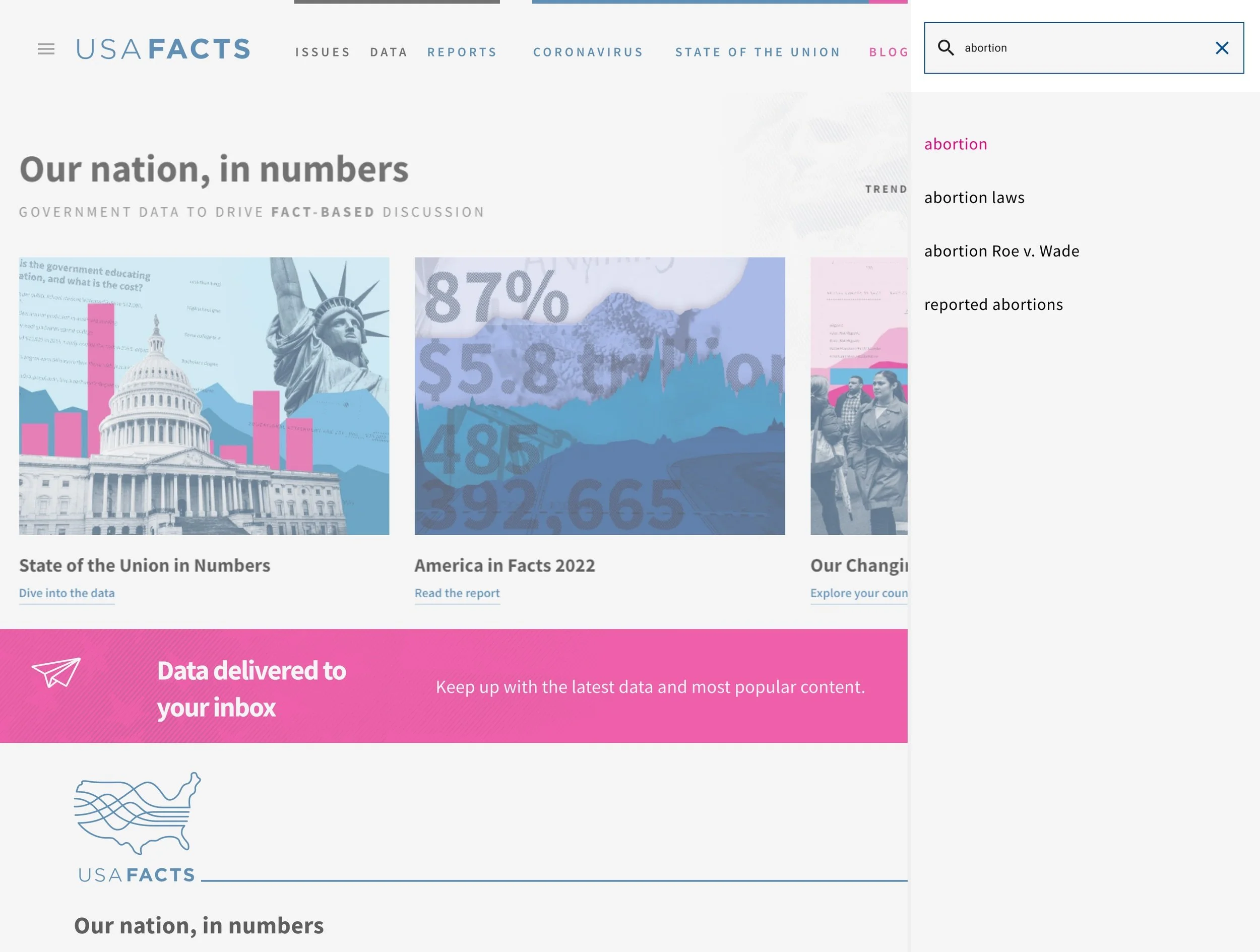
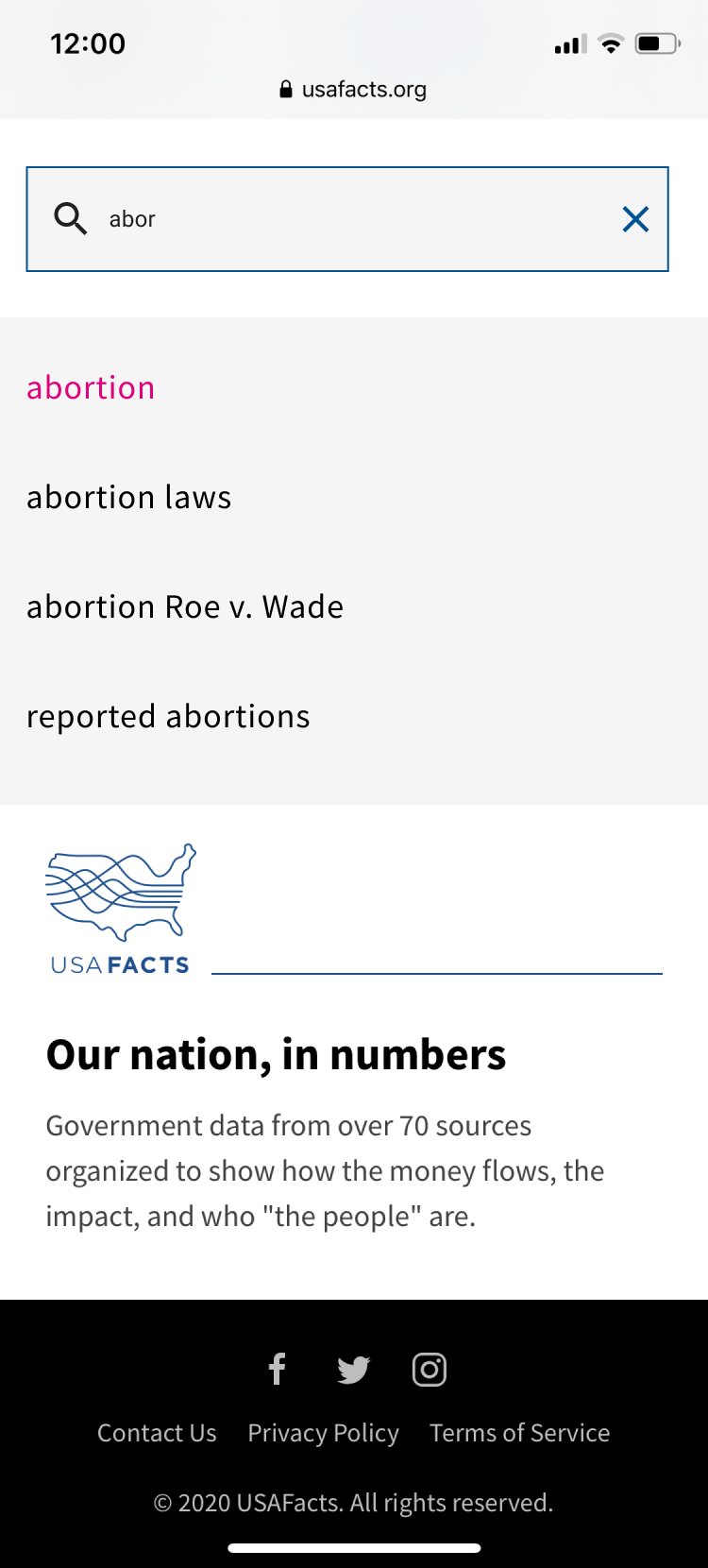
Type Ahead
Type Ahead also helps to improve search efficiency. When a user begins typing, matching search terms appear after three letters have been typed. The bolded part of the word shows the match between the typed word and the recommended term.
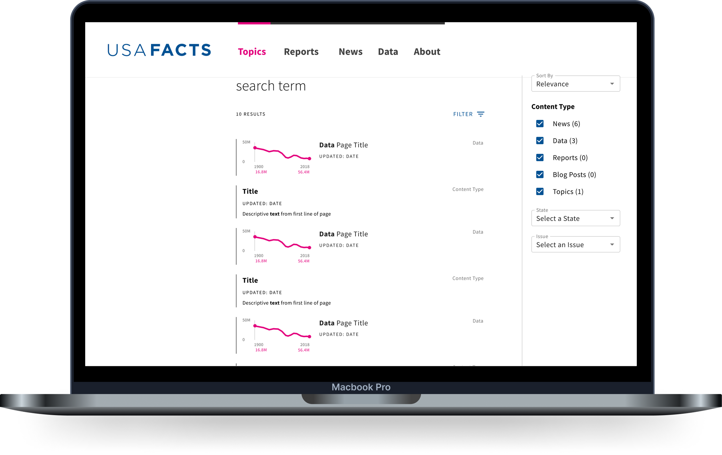
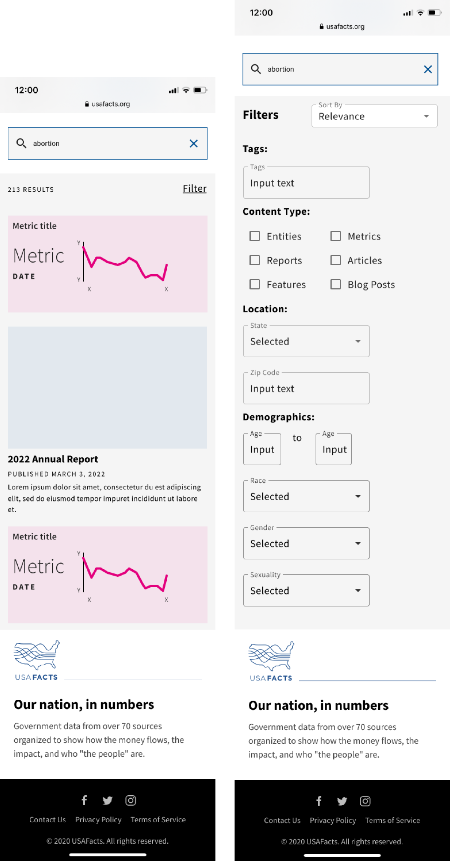
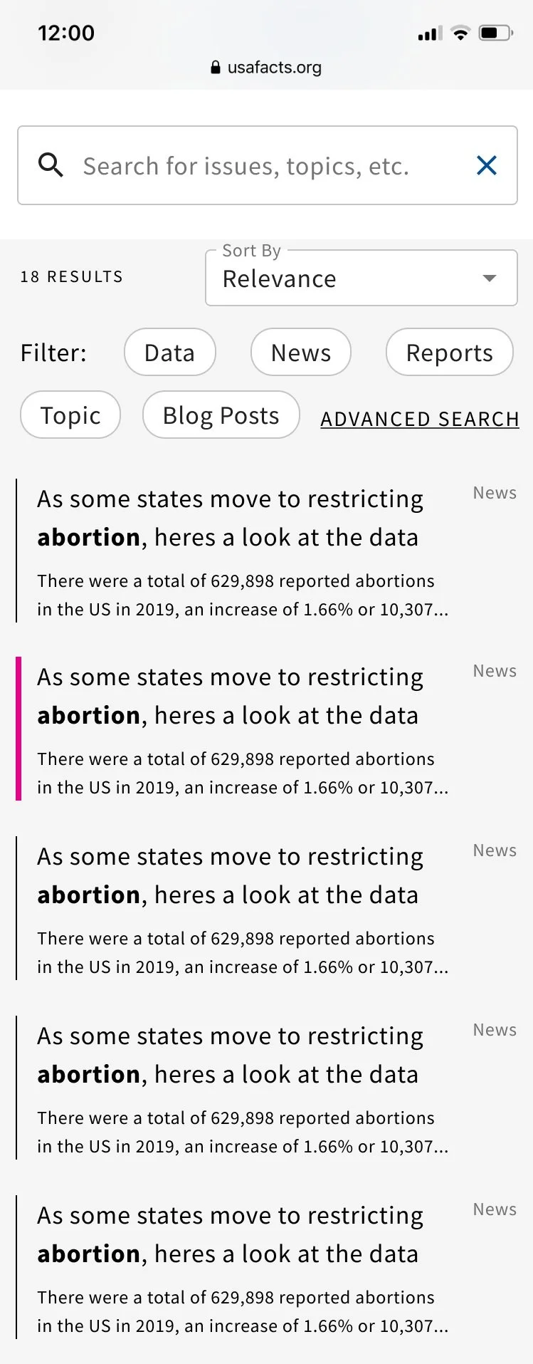
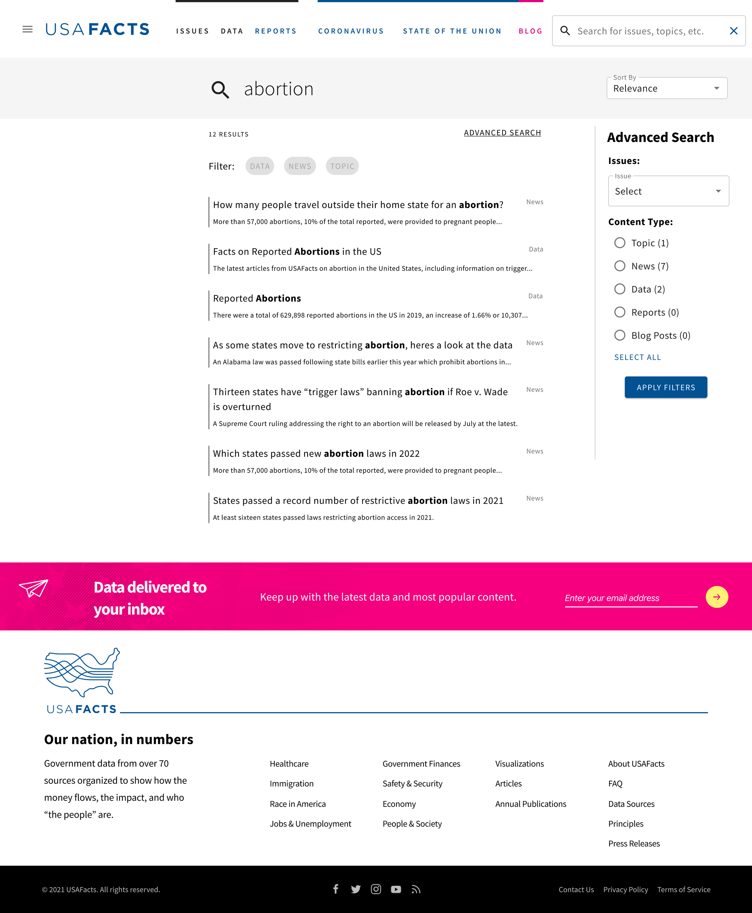
Search Results & Filtering
Once a user has entered a search term, results will be displayed to them. Text based result types (such as articles, news and reports) are accompanied by a short text description below. Data results are displayed with a thumbnail of the related graph. These added details help a user decide whether they want to click into those results to view more information.
Filters are initially hidden on both desktop and mobile, but can be accessed by clicking the “Filter” button in the top right corner. From there, users can filter the results by content type, state, and issues. They can also change how the results are sorted.
The way that results are displayed and the available filters will help users find what they’re looking for quickly and easily.

No Results Found
If a user searches a term that isn’t found on any of the site’s content, alternative or related search terms will be displayed. There will also be recommended content based on their browsing history and the term that they searched.
This will help the user find what they’re looking for, and find other content that will keep them engaged with the website.

Reflecting
Looking back on this project, I’m amazed at how much I’ve learned and all of the work that I did. This was my first ever internship, so there was a lot of learning I had to do about what it means to work in an organization, with stakeholders and real users. There were lots of opportunities to learn from professionals in the field, and I know that I gained lots of knowledge that I will carry with me into my next job opportunity.
There were two things that stuck out to me as things that I take pride in from this project. The first being that I made a lot of data driven decisions based on the research that I conducted myself. Through two phases of research, I got a lot of important insights from users. However, I do think I should’ve run the concept testing study with real users instead of internal participants. Internal participants came into the concept testing with a better understanding of some of the details of the website, so they missed some key usability issues that might have been more quickly discovered with real users.
The other thing that I’m really proud of in this project is that I advocated within the organization for better metrics to be collected on search. When I started exploring the metrics at the beginning of my internship, I noticed a lack of depth to the metrics being collected and also a lot of confusion regarding which metrics to trust. For example, Google Analytics was collecting data on the most popular search terms on the site, but didn’t accurately collect the click through rate (guages how well results match what the user is searching for) and the search exits (measure the number of exits that occur following displayed search results). Due to this lack of data, I took it upon myself to advocate for better metrics. I did the research on what would be useful and made tickets for engineering to set those metrics up. That way in the future, the company can compare the current search experience with this proposed one and measure the success of my redesigned search experience.