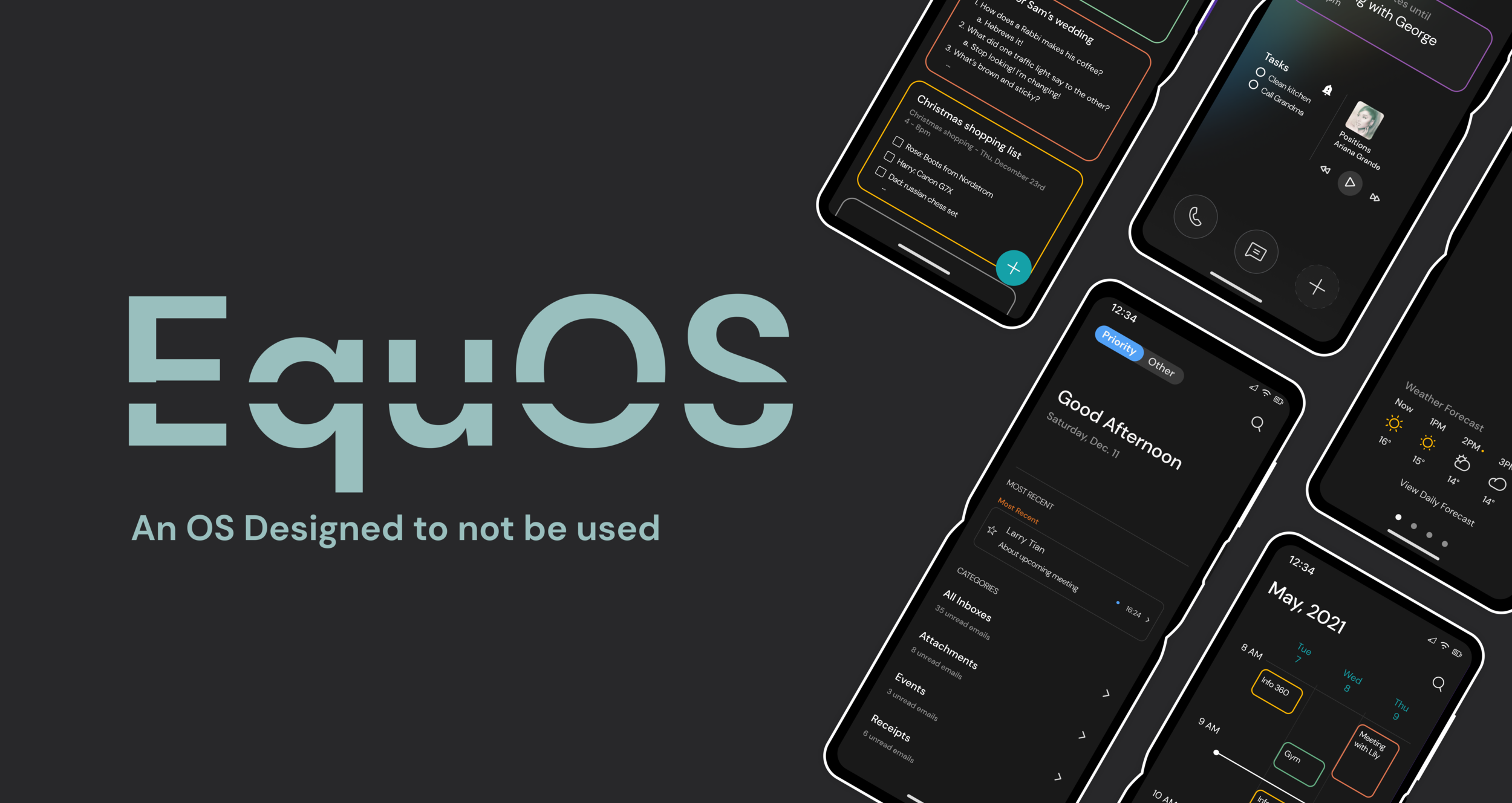
Context
The first day of class, our professor threw us to the wolves:
“You have ten weeks and a team of seven with which you will create a unique mobile OS and 15 native apps, good luck!”
And with that, the quarter began. I somehow stumbled into a great group of 6 other designers with varying levels of expertise and passions, and we began the intimidating process of creating our own OS.
Timeline: 11 weeks (Fall 2021)
Project Type: Class Project (INFO 365: Mobile Application Design)
Team: 6 Other Designers & I
Programs Used: Figma, Pitch
My Role: Co-Lead & UX Designer
Methods: Interaction Design, User Research, Visual Design
Focus Areas
Select a focus area below to skip to the section that interests you most. Or read them all!

Coming up with a Unique OS

Tackling our Biggest Problem: Notifications

Designing a Useful Calendar
Brainstorming
We started off by ideating with no limits. Who did we want to design for? A millennial plant mom? A working dad? A girl boss?
With all of these potential users in mind, we began to think about pain points that we experience in our everyday lives with the current OS’s that we use, and we hit a gold mine. All of us were frustrated with the amount of time we spent on our phones and how we were so easily distracted by them instead of being productive.


“What if we could make a phone that is designed to not be used?”
We did some background research to see if this was truly a problem that people were concerned about.
Turns out, we weren’t the only ones frustrated...
89%
of phone users use their phones during social gatherings
43%
of Americans check their phones every 6 mins
42%
of constant checkers worry about their mental and physical health
Solidifying our Problem Area

Who are our users?


What does designed not to be used even mean?
This motto may seem a little insane, but the extremity of it helped us really focus on giving our OS a purpose. We defined “designed not to be used” as:
giving users freedom to live in the present
minimizing temptations like social media and other distractions
minimizing interaction while still being practical
easy to use
All of this came down to creating Equilibrium for our users between their life and the digital world. And thus, our design language was born. We came up with four principles for Equilibrium to guide our design and experience building.
Minimalistic
not distracting or addictive; calm
Streamlined
efficient and effective, presents little resistance, intuitive
Balanced
not restricting users; allowing users to be present in a technology-driven world
Reliable
can count on to eliminate distractions and promote being present in the moment
The Physical Device
Although they are a fairly new technology that hasn’t quite hit its stride yet on the market, we decided to design our device as a folding phone.
This was a very intentional decisions. After much debate, we realized that the physical act of closing your phone was not only satisfying, but it created a physical barrier between you and your digital life on your phone. We thought that having this physical barrier would prevent users from getting sucked into their phones as easily. This way users can view their phone as a tool rather than entertainment.

Creating a Style Guide
When starting to consider the visual design of our OS, we turned back to our design principles. We chose to design an entirely dark mode OS not only because all of our team uses dark mode on a daily basis, but also, because dark mode is less stimulating than light mode. Again, this intentional decision would ensure that users feel less inclined to use their phone constantly.
We also opted to color coordinate interconnected apps to help users build mental connections via visual clues. This would reinforce the streamlined nature of our operation system, where users can interact seamlessly between apps.

Tackling our Biggest Problem: Notifications
From here, we realized that the biggest issue when it comes to users scrolling endlessly instead of living in the present was notifications. These tiny little reminders pinging us constantly about all of the interesting things that are happening in the digital world steal our focus for half a second and then draw us in for hours.
So, we had to reimagine this. But first, a survey! We sent out a Google Form via social media (Reddit, Discord, Slack), and got responses from 20+ busy professionals and students about their relationship with their phones, notifications, and living in the moment.
What do people think of their current notification system?
70%
of people that said that notifications with just the app logo and number of notifications were less likely to prompt people to open the app
60%
of people that think their current notification system is somewhat disorganized
54%
of people that feel somewhat annoyed when notifications appear on their phone, especially unimportant ones
With our assumptions validated, we were off to the races!
To begin, we brainstormed what we thought the screens could look like for notifications, both on the small outer screen and the large inner screen. We considered the interactions that users would take in order to access notifications, and how to balance friction and access. We decided to develop a use case to think through how people would actually check notifications on a folding phone. We realized that the small screen would be vital for notifications.
Ultimately, we wanted notifications to be accessible, but not distracting for users. To ensure this on the inner large screen, we made them only accessible through the home screen by double tapping.


Use Case

Designing Notifications

We also split notifications into two categories, Priority and Other, which would become a pattern across our apps. Priority notifications would be identified by context and by the users preferences. For example, users could identify priority contacts like parents, significant others, and friends, and all of their messages and calls would display in the priority tab. We also considered the potential of AI in helping to make decisions about what counts as Priority.
When moving up to mid-fidelity, we debated the look of the actual notification banners. For Priority notifications, we landed on a very familiar look, with the app details and notification information. With this, though, we decided to add an “x” indicator on the right side of the banner to encourage users to get rid of notifications after seeing them so as not to create further distractions later.
We asked in our survey. “Which of the following notification would prompt you to open the app?” and only 30% of respondents selected “Notifications with just the app logo (with the number of notifications indicated)”. This indicated to us that this was the less enticing form of notifications, so we implemented this in the Other notifications tab. This way users are less likely to tap into distracting apps like Instagram and TikTok.
From there, we moved into high fidelity. Our first iteration incorporated many of the initial design decisions. We also decided to implement skinned app icons. These would appear in the Other tab of the notification overlay. We chose to do this because we thought that these icons were less enticing than the more colorful icons of typical social media.

When we presented the above notification screens in our third design review, we got a lot of helpful feedback. One of the most important pieces of the feedback we got was that the home and lock screens didn’t seem cohesive with the feel of our other apps and our dark mode OS. Our professor also noted that the Priority and Other navigation don’t look like buttons in our initial design, and that a tabular nav bar is an outdated design.

Designing a Useful Calendar
Later on in the quarter, two of my teammates and I tackled the Calendar app. At this point, we had determined our concept, established a style guide and a design language, and tackled several apps. We had made several apps that had integrated features with the Calendar app, but we had yet to create the Calendar app. With these dependencies in mind, Nicole, Hadar and I began to brainstorm features and ideas for the Calendar app.
We started with divergent brainstorming, each taking time before our studio class time to come up with our own ideas. When we reconvened in class, we each presented our ideas and discussed the possibilities that they gave.

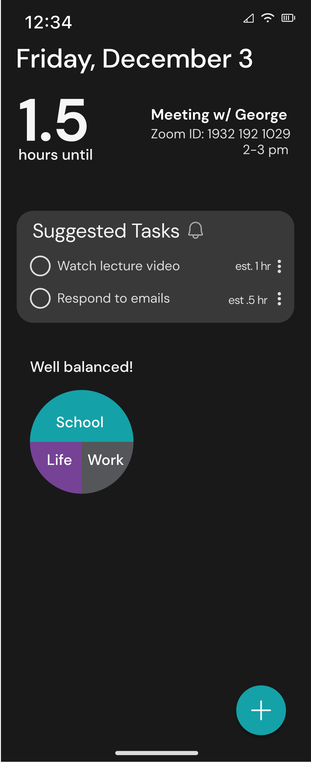
While we were discussing this, our Professor came to give feedback and see if we needed help. He suggested we move away from typical calendar layouts that looks at time linearly. This left us confused, but motivated. We shifted towards a dashboard view, that would give information in a schedule like layout, with information about the balance of a users schedule, their next events, and suggested tasks.
-
![]()
This concept focused mostly on events and tasks. The dashboard would suggest tasks based on when the users unplanned time is and keep track of their progress.
-
![]()
This concept was similar, but implements a count down feature to the next event rather than listing all of the events throughout the day. It also shows the breakdown of events for the day.


It just wasn’t sitting right...
So I went back to the drawing board... literally. My teammates continued to design on Figma and I began to brainstorm on my own. I thought through our four design principles, and how they related to using a Calendar app. I thought about how the Calendar app through the lens of our user personas, and I landed on an important idea: unplanned time.

I called my teammates over and explained my thought process and what all of these in-coherent drawings meant. They were on board. We started to brainstorm what the implications of unplanned time were. We realized people should be able to decide for themselves, based on their mood and their responsibilities, how they filled their time between events. The one thing they needed to know is: what is the next event, and how much time they have before it. From there, they could decide what the best way to spend their time (whether that is catching up on emails, starting a project, or spending time with loved ones).
Introducing: A New Daily View
This was the screen that I worked on primarily, and its also the most unlike other calendar apps daily views. For this, we really wanted to focus on providing users with important information without totally overwhelming them with everything they have to do in a day.

Weekly & Monthly View
For these views, we chose to go with a familiar layout, but make the information less overwhelming than existing calendar apps. For the weekly view, we changed it to only show three day. In the monthly view, rather than showing all of the information for every event (like Google Calendar), we chose to just show dots related to the color of the event, and then users can tap a day to view more information.
Navigation
You may have noticed that our Calendar app is missing navigation between pages. This is because we opted to use gestures for navigation. Rather than tapping a button to swap between different calendar views, users can pinch in or out to zoom in or out of a view. For example, if a user wanted to go from the daily to the weekly view, they can zoom out by pinching in. This is already a common gesture when people are viewing pictures, so we thought it would be an interesting element that would help simplify the UI (by removing navigation elements) and help users conceptualize time in an interesting way.

Implementing NLP
Through discussions with our Professor, we learned about the power of Natural Language Processessing, and how quickly and easily computers are able to process words. We decided to implement this in the calendar because of how tedious it can be to fill out the details of an event, especially if its reoccurring. With NLP, users can simply type in or speak the details of the event and the information autofills, and the event is added to the calendar. This ties into our design values of a streamlined system that is efficient and easy to use.

Final Product
At the end of the quarter, the professor handed off our final deliverable to his industry professional friends to rate on a 5 star scale (just like if it was being reviewed for the app store!). Our team tied for 1st, earning 5 stars! See our final product below:


Below are more of the apps and screens that we made throughout the quarter. Click an image to see the design up close!


Reflecting
Looking back on this project, I am really proud of how far my team has come. In terms of improving the OS, I think we could have pushed ourselves even further by choosing a challenging app such as creating a social media app that fits within the “designed to not be used” concept. Additionally, I think conducting user testing with our final product would be really beneficial considering we did not have time to do it with such a short timeframe.
My biggest takeaway from this project is the power of trust and synergy. Early on in the quarter, my team bonded by talking about our relationships and dating experience. By connecting outside of the classwork, we were able to deepen our friendship and our trust. Having such a deep trust in each other payed off, it allowed us to be brutally honest with our criticism, to trust each others design decision making, to feel safe enough to ask for help when we needed it, and to trust each other enough to take risks and share our ideas. This trust and synergy that we built as a team truly pushed us all out of our comfort zone, which, I believe, is why our final product performed so well! This has taught me to always spend time getting to know the people I am working with, because it will benefit me in the long run!

Thank you to my wonderful team for making this such an awesome quarter and project! <3